


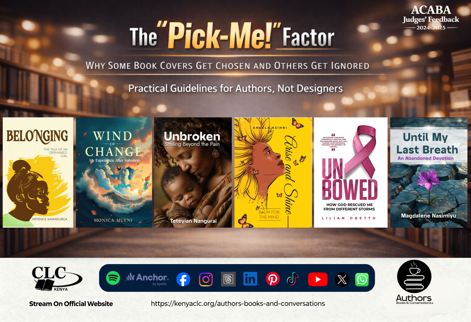
Your book cover is not decoration—it is your book’s first decision-maker. Discover why covers matter for trust, genre clarity, and sales, plus common mistakes authors can avoid and a practical checklist for creating a cover readers choose, not ignore. Learn More Here. #RaisingAfricanVoices
Read More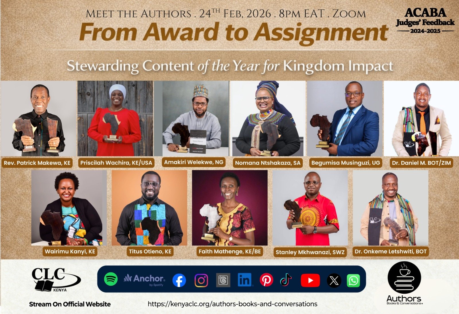
Register in Advance
Registration closes 1 minute to the set time on the D-day.
Register on ZoomTip: If you don’t see the email, kindly check Promotions/Spam.
Authors, Books & Conversations
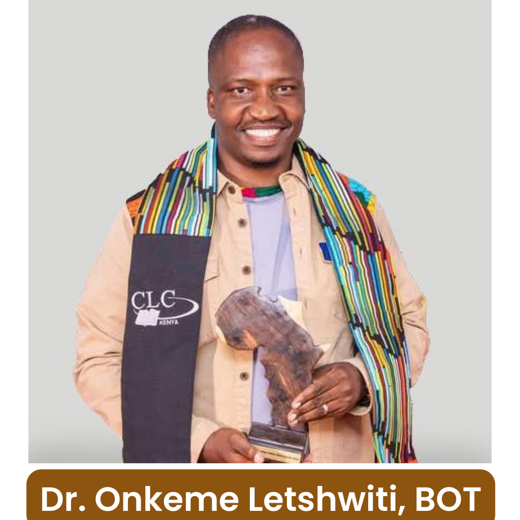
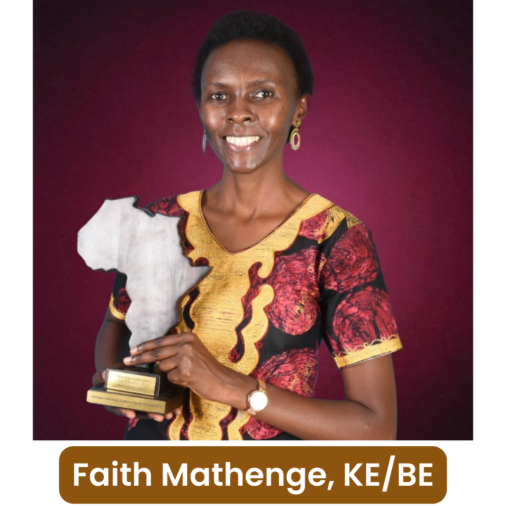
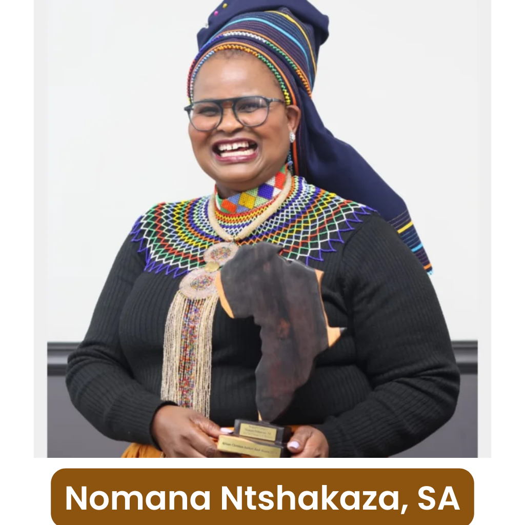
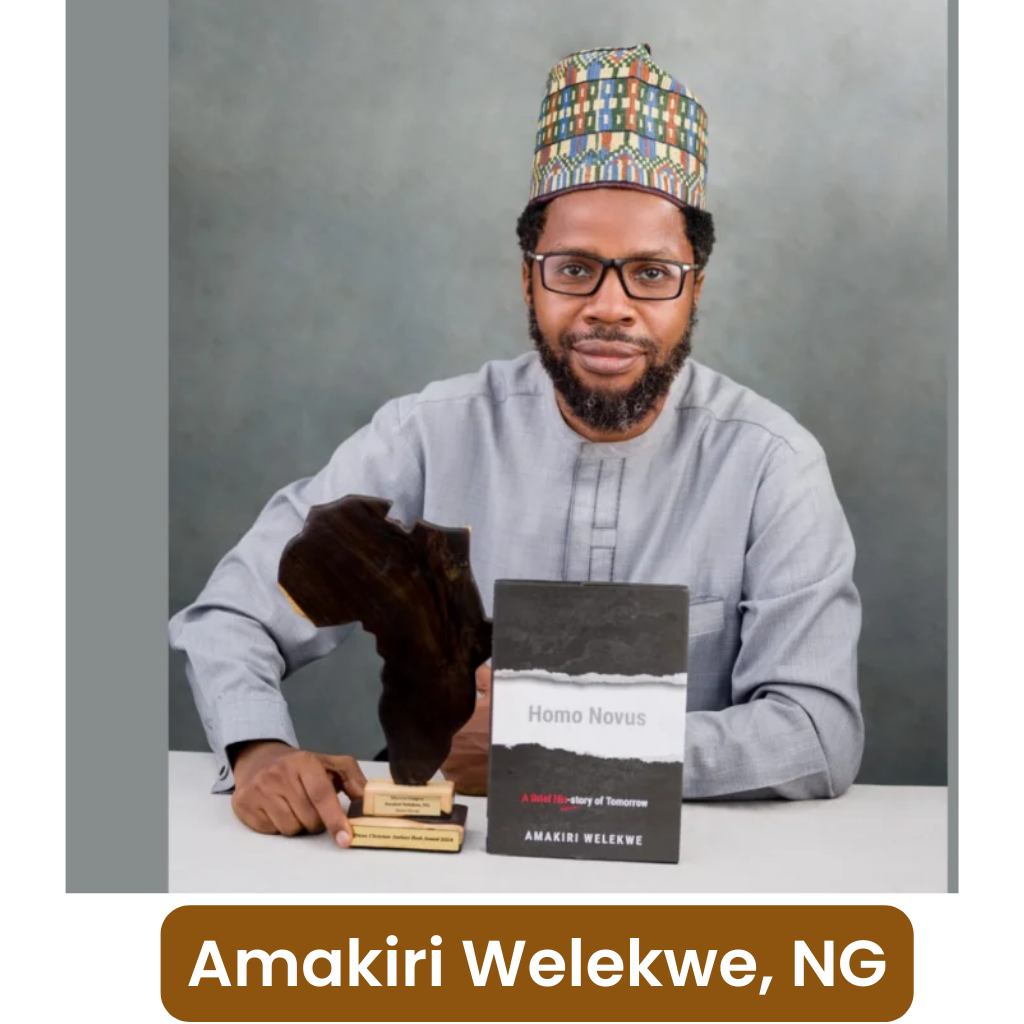
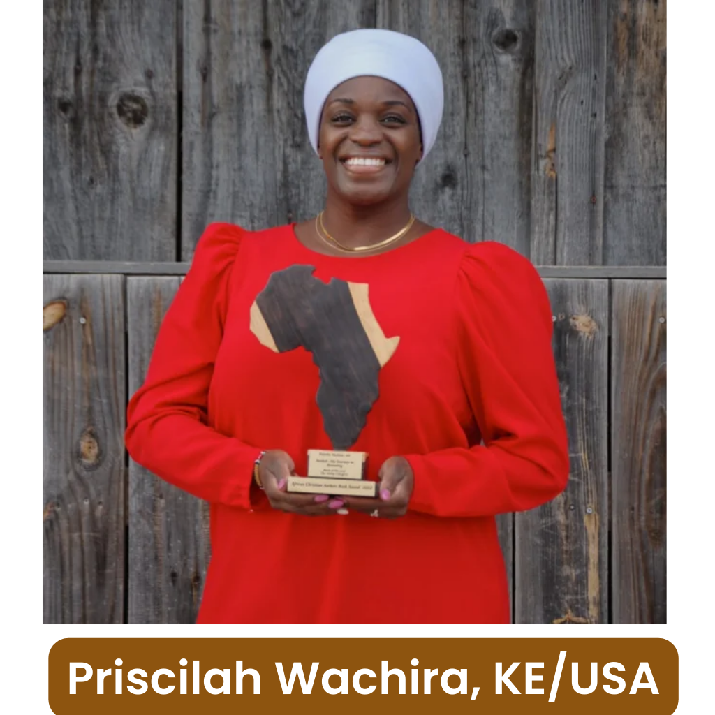
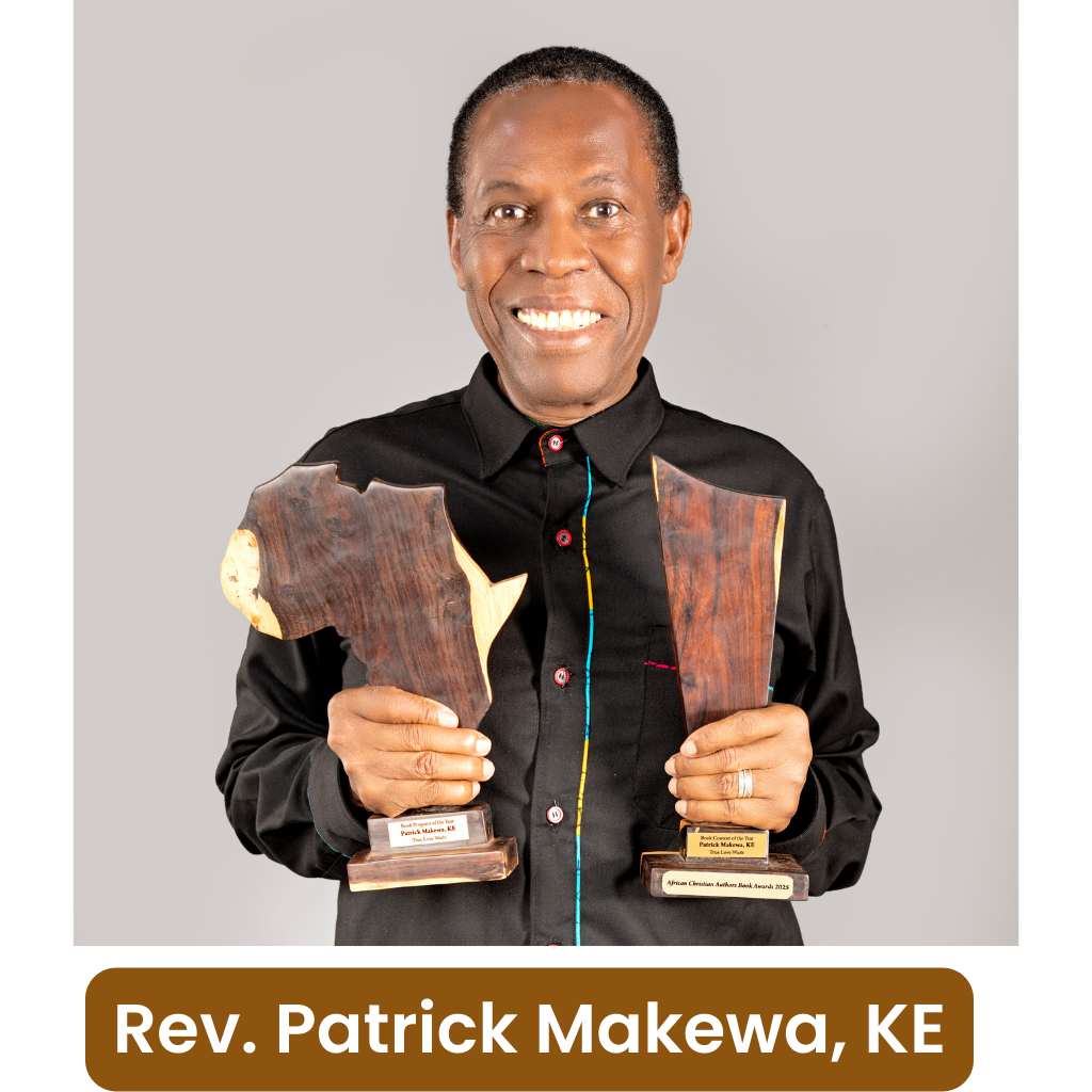
From Award to Assignment: Stewarding Content of the Year for Kingdom Impact
For readers, this is your front-row seat to listen to the hearts behind the books—why these authors wrote what they wrote, what God was teaching them, and how the message is meant to serve lives beyond the final page.
For authors, it is a practical and encouraging guide to what happens after the win and how to keep your book “alive” through discipleship-minded platforms and intentional engagement.
Want the full context before the session?
Read the article first, then bring your questions to Zoom.
Jump to the Article
Opens the article link
Watch below
Click the poster to start the video player
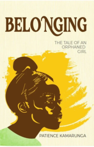
Book 1:
Belonging: The Tale of an Orphaned Girl
Author: Patience Kamarunga, Uganda
Belonging is a hope-filled, true-life inspired story that speaks to the ache of abandonment and the search for acceptance—especially for orphans and anyone who has felt forgotten. It is written to strengthen the reader’s courage to keep going and to believe that their story can still carry meaning and restoration.
Why We Love It
The face tells the story before you read a word. The profile of the girl—eyes lifted, thoughtful, slightly burdened—immediately signals emotion and personal journey. It creates empathy fast, which is exactly what a memoir-style story needs. (In fact, ACABA feedback notes the girl’s eyes make you want to read and know her story.)
A strong, single focal point. There is no clutter. Your eyes land on the girl first, then the title, then the subtitle. That clean hierarchy is the “Pick-Me!” factor on a shelf or a phone screen.
Colour that carries meaning. The warm golden brushstroke behind the girl feels like a spotlight—suggesting worth, visibility, and hope breaking through a hard beginning. It visually reinforces belonging without preaching it.
Typography that feels steady and serious. The bold, classic title font gives credibility and weight—fitting for a true-life tale—while the subtitle is lighter and quietly supportive, not competing for attention.
A memorable, recognisable silhouette. Even at thumbnail size, the cover remains distinctive. The shape of the head and the bold colour block make it easy to recognise quickly—an underrated secret of high-performing covers.
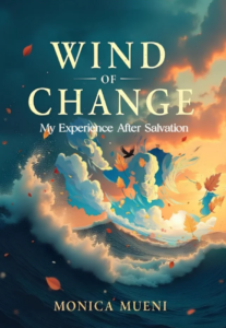
Book 2:
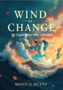
Wind of Change: My Experience After Salvation
Author: Monica Mueni, Kenya
Wind of Change is a reflective Christian testimony-style book that explores the author’s journey after salvation—what shifts internally, what gets challenged externally, and how spiritual transformation begins to reshape desires, choices, and direction. It reads like a lived experience of renewal: real, personal, and anchored in the “after” of encountering Christ.
Why We Love It
The concept matches the title perfectly. The swirling winds over the ocean and the restless, rolling waves visually communicate “change” in motion—how a powerful wind can stir what looked settled. The artwork doesn’t just decorate the title; it interprets it.
Simple, clear, and confident. This cover understands the discipline of less is more. There’s a strong balance between text and background—nothing fights for attention, and nothing feels cramped. The design is clear in what it is trying to communicate, and the eye knows exactly where to go first.
Excellent typography choices and sizing. The title is bold, visible, and properly sized, with neat, central alignment that shows intentional design thinking. Even at a thumbnail size, “WIND OF CHANGE” remains readable and prominent—this is a huge “Pick-Me!” factor online.
Warm and cool colours that carry emotion. The blend of warm sunset tones with cool ocean blues feels harmonious and cinematic. It evokes renewal, hope, and spiritual transformation—warmth suggests awakening and promise, while cool tones suggest depth, process, and seriousness.
Strong visual harmony and symmetry. The design feels comfortably balanced to the eye. The composition holds together beautifully, with the dynamic movement contained inside a stable overall layout. That mix—movement within order—mirrors spiritual growth itself: transformation without chaos.
Engaging without being noisy. The floating leaves, the bird silhouette, and the painterly storm-light atmosphere create interest and emotion without clutter. It draws you in gently, then holds you there.
Book 3:
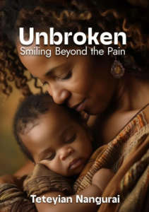
Unbroken: Smiling Beyond the Pain
Author: Teteyian Nangurai, Kenya
Unbroken: Smiling Beyond the Pain is a deeply personal, hope-centred memoir that journeys through grief, loss, and the slow work of healing. It carries the reader from the weight of pain to the quiet strength of resilience—showing that even after heartbreak, restoration is possible and joy can return, not as denial, but as victory.
Why We Love It
Instant emotional connection (the “Pick-Me!” factor). The cover does what many memoir covers fail to do: it makes you feel something immediately. The tender moment between mother and child communicates love, vulnerability, and protection at a glance. Even before reading the subtitle, the reader senses, “There is a story here, and it matters.”
The image matches the message without over-explaining it. “Unbroken” could have been portrayed with dramatic symbols—cracks, chains, storms, shards. Instead, the cover chooses a more mature route: it shows quiet strength through intimacy. The softness of the embrace subtly communicates endurance—pain has happened, but love remains, and life continues. That restraint is powerful.
Warm, cinematic colour grading that suggests healing. The warm browns and gold tones create a safe, gentle atmosphere. Warm palettes are psychologically associated with comfort and closeness—perfect for a memoir that speaks about surviving pain and finding the courage to smile again. It feels like a “safe book” to open.
Excellent typography hierarchy and readability. The title Unbroken is bold, clean, and highly readable—especially important for online thumbnails. The subtitle is smaller but still clear, and it sits naturally beneath the title, reinforcing the emotional tone. The author’s name anchors the bottom with confident spacing and visibility. Nothing feels squeezed; everything has room to breathe.
A strong focal point with natural leading lines. The viewer’s eyes move exactly where they should: title → mother’s face → baby → author name. The composition uses the curve of the embrace and the gentle angle of the mother’s face to guide attention. This is professional visual storytelling.
Genre alignment and audience clarity. This cover clearly signals “memoir / true story / healing journey.” It does not look like fiction. It does not look like a textbook. It looks like a real-life testimony—human, vulnerable, and restorative—which helps the right reader choose it quickly.
The subtitle is a promise, and the photo supports it. “Smiling Beyond the Pain” could sound like a cliché if the image did not back it up. But the soft expression and peaceful mood make it believable. The cover doesn’t shout triumph; it shows tenderness—like someone who has been through something and is learning to breathe again.
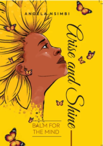
Book 4:
Arise and Shine: Balm for the Mind
Author: Angela Nsimbi, Uganda
Arise and Shine: Balm for the Mind is a faith-rooted encouragement book that speaks to inner battles of the mind and the journey towards healing, hope, and renewed strength. It’s written from lived experience—pointing readers towards restoration and a healthier, steadier thought-life through biblical truth and practical reflection.
Why We Love It
This cover is visually striking, uplifting, and emotionally evocative—the kind that stops a reader mid-scroll and says, “Look here.”
Colour that instantly communicates the message. The warm, optimistic yellow is not just pretty—it is purposeful. It signals positivity, light, and forward movement, perfectly matching the title Arise and Shine. It feels like hope in colour form, which is exactly what the reader expects from an inspirational book.
Symbolism that adds depth without clutter. The butterfly motif is a beautiful, universal symbol of transformation. It reinforces the book’s promise of growth and renewal—quietly but clearly—without needing extra words. The symbolism is easy to grasp, making the cover emotionally resonant even at first glance.
A unique, engaging visual identity. The illustration style and bright palette help it stand out among other titles while still aligning seamlessly with the self-help/motivational genre. It feels distinct enough to be memorable, yet familiar enough to be trusted by the target reader.
Professional composition and eye-flow. The design is well-balanced and visually harmonious. Your eye is guided smoothly from the central imagery to the title and then down to the subtitle—an important sign of thoughtful layout and strong cover hierarchy.
Typography that supports, not competes. The title is clearly prioritised, while Balm for the Mind complements it without overpowering the design. That restraint is a major strength: it keeps the cover clean, readable, and confident.
Polished execution. The overall finish is professional and free of errors, showing high-quality design technique. Nothing feels accidental; the cover communicates that the content inside has been handled with equal care.
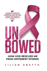
Book 5:
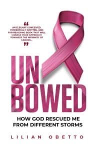
Unbowed: How God Rescued Me from Different Storms
Author: Lilian Obetto
Unbowed is a faith-filled, testimony-style journey of resilience through multiple life storms—centring on a cancer battle and the wider trials that come with it. It tells a story of survival, divine help, and the strength God provides when suffering tries to bend a person’s spirit. The subtitle frames the narrative clearly as a lived experience of hardship met with God’s intervention—an inspiring biography that points readers towards hope.
Why We Love It
This cover works because it is immediately clear, professionally structured, and emotionally strong, while still remaining elegant and easy on the eye.
Instant communication of subject matter.
The breast cancer ribbon is a universal symbol, and here it does its job perfectly: within one second, a reader understands the topic and emotional terrain. The ribbon communicates what the book will be about—without confusion or guesswork.A clean, well-balanced design with excellent white space.
The cover is uncluttered and confident. The generous white space gives the design a premium, “professionally published” feel and allows every element to breathe. It’s visually calm—which is important for a heavy subject—yet still compelling.Cliché symbol, fresh execution.
Yes, the ribbon is common. But the way it is designed, positioned, and aligned with the titling moves it beyond cliché. The ribbon isn’t simply placed; it is integrated into the overall structure so the concept feels intentional and well executed.Typography that follows the ‘order of threes’.
The titling follows a strong hierarchy: Title, Subtitle, Author—each clearly differentiated to play its role. This creates balance and harmony, and it also makes the cover highly readable in print and online.A strong “funnel” flow for the eye.
The reader’s eye moves naturally: endorsement quote → ribbon → bold title → subtitle → author name. None of the parts competes. None swallows the other. They work together like a well-rehearsed choir—distinct voices, one message.Smart colour choice and blending.
The pink tones connect instantly to breast cancer awareness, while the colour blend is rich and visually attractive. It conveys both reality and hope—serious, but not depressing; strong, but not harsh.Texture inside the title adds meaning and sophistication.
Filling the title letters with ribbon texture is a brilliant detail. It adds tactile interest (you almost “feel” the material), increases visual depth, and symbolically ties the theme of cancer and endurance into the very word UNBOWED—the title doesn’t just say something; it shows it.It engages at a glance and sets the genre expectation correctly.
The subtitle clearly signals biography/testimony and frames the story as a journey through storms, anchored in God’s rescue. Readers immediately know: this is an inspiring real-life story, not fiction, not a medical manual.
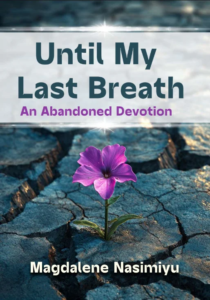
Book 6:
Until My Last Breath: An Abandoned Devotion
Author: Magdalene Nasimiyu, Kenya
Until My Last Breath is an inspirational, devotional-style book that speaks to seasons of abandonment, hardship, and spiritual dryness—yet calls the reader to keep trusting God with unwavering faith. It is the kind of book that meets people in their “cracked earth” moments and gently reminds them that God can still bring life, beauty, and hope where nothing seems able to grow.
Why We Love It
This cover works because it is symbolic, emotionally resonant, and instantly clear about genre and tone.
A powerful, simple visual metaphor.
The single purple flower pushing through cracked earth is immediately compelling. It communicates resilience, perseverance, and hope without needing explanation. It’s the visual equivalent of a testimony: life breaking through barrenness—faith still standing when circumstances are harsh.Instant emotional engagement.
The lone flower instantly invites reflection and curiosity. It makes the viewer pause and think, “What happened here?” and “How did this survive?” That emotional pull is exactly what you want for a devotional that touches pain yet points to God’s sustaining grace.Strong composition and contrast.
The centred composition gives the cover a steady, contemplative feel, while the strong colour contrast ensures the flower becomes the natural focal point. The purple draws the eye effectively and creates a clear visual “hook” even at thumbnail size.Clear, readable hierarchy (title → subtitle → author).
The title and subtitle are easy to read, and the hierarchy clearly signals the genre: inspirational/devotional. The subtitle confirms tone and theme, while the author name anchors the bottom with good visibility. Nothing feels confusing or hidden.Thoughtful colour alignment.
The colours are used intelligently: the title tones harmonise with the rocky ground, and the subtitle echoes the flower’s purple—subtly tying text to imagery. That kind of intentional colour linking is a quiet mark of professional design.Balanced image and text overall (with one small caveat).
The cover achieves a good balance between imagery and text, establishing mood and anticipation even if it offers more thematic symbolism than narrative detail—which is perfectly suited to devotionals.
Minor note: the title banner is slightly heavy and creates a visual separation between text and imagery. However, the overall design remains striking and meaningful, and the banner also boosts readability—especially online.Professional finish.
The layout is clean, the typography is readable, and there are no visible spelling or grammar issues. The image quality and composition signal thoughtful art direction and professional tools—making it a cover that would hold its own on a bookstore shelf or display window.
Subscribe for wholesome content!


×